uPArt: A pixel art sketchbook built on Unity3D.
User Manual
Concept
Just start drawing!
You have a 1024X1024 canvas at your disposal and nearly infinite pages in your sketchbook (limited by hardware memory). Just start drawing anywhere! If you need to adhere to a particular size then activate the guideline system to give you a visual reference. Ever hit the edge of your canvas because you misjudged where to start? Never again with uPArt's origin system. Set origins for your pages on the fly!
What I need, when I need it!
Workflow was the primary driving force in uPArt's development. User interface focused on keeping the tools you need right in front of you! Don't make the user do in 2 clicks what can be done in 1.
Little is BIG
The scope of uPArt is on the smaller side. I would say that large pixel art is in the 128X128 range. That is just my opinion. Most of my artistic exploits are smaller than 128X128 and this is where uPArt excells. Once you start getting into the 512X512 realm you've ventured beyond the scope of the tool I set forth to write. You begin to lose some of the freedom given by the dynamic origin system. Then why is the canvas 1024X1024? I said that you've ventured beyond the scope… I didn't say I wouldn't let you! I would love to see what people think about using uPArt for larger pieces though I haven't tried anything that large myself.
Terminology
Touch Devices
Tap: touch the screen and release immediately.
Long Tap: touch the screen and hold until you see a burst animation from the held location then release.
Drag: touch the screen and slide your finger.
Pinch: touch the screen with 2 fingers and drag them closer or farther apart.
Dab: touch the canvas and release immediately to paint or erase a pixel.
Stroke: touch the canvas and drag then release to paint a group of pixels.
upt: file extension used by uPArt.
Non-Touch Devices (Using a Mouse)
Tap: click the left mouse button.
Long Tap: press the left mouse button and hold until you see a burst animation from the held location then release.
Drag: press the left mouse button and slide the mouse.
Dab: click the left mouse button to paint or erase a pixel.
Stroke: press the left mouse button and drag then release to paint a group of pixels.
Swatches
| Icon |
Function |
 |
Swatch: Selects the color that will be used when painting.
Tap icon to activate the swatch and use its color for painting.
Long tap icon to show the color picker window.
Use the color picker window to assign the swatch's color.
To finalize your selection and close the window tap
the active swatch again.
To cancel your color selection and return the active swatch
to the previous color tap any other inactive swatch.
There are 4 swatches available and each can be assigned its own color. |
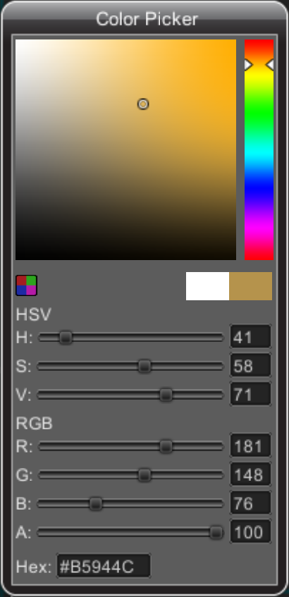
Color Picker Window
|
uPArt's color picker window supports all the
standard functionality of other color pickers.
You can select a new color in 4 ways.
Drag up and down on the vertical HSL bar to select a
base color. Then drag around the main color selection
square to pick the shade.
Drag the various RGB and HSV sliders to change the numeric
values or tap the number to manually enter numbers with the
on-screen keyboard.
Tap the Hex input to manually enter the hex
representation of a color using the on-screen
keyboard.
Tap the Custom Colors button  to open the to open the
Custom Colors Window where you can save and load
colors.
|
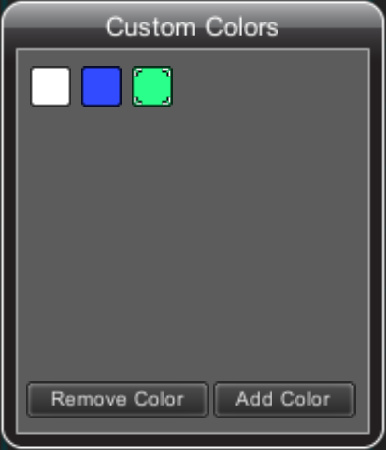
Custom Colors Window
|
Use the Custom Colors Window to save and load colors.
Colors you save here are saved to the upt file so they'll
be there the next time you load your work.
Simply click the "Add Color" button to save the color
selected in the Color Picker Window as a Custom Color.
To SELECT a custom color, tap a colored square.
This will make the custom color active and
the Color Picker Window's selected
color will change to the custom color you tapped.
To EDIT a custom color, activate a custom color
by tapping a colored square. This will make the
Color Picker Window's selected color change to the
custom color you tapped. Now any changes you make
in the Color Picker Window will also change the active
custom color.
To DEACTIVATE a custom color tap the active colored
square again. Changes to the Color Picker Window will no
longer alter you saved color.
|
Tools
Note: Tapping an active tool will deactivate it and return you to paint mode.
| Icon |
Function |
 |
Dropper: Changes the active swatch's color to the color of the tapped pixel.
Tap icon to activate the tool.
Tap a pixel to select its color. |
 |
Eraser: Erases pixels.
Tap icon to activate the tool.
Tap a pixel to erase it.
Long tap icon to erase all pixels. |
 |
Eye: Toggles High Contrast Mode.
Tap to toggle High Contrast Mode on and off.
In High Contrast Mode the grid will be shown overtop of your page and
a checkerboard background will be shown. |
 |
Origin: Change page's origin.
Tap icon to activate tool.
Tap canvas to set the origin to the tapped location.
The horizontal position of the origin marker represents the center of your drawing.
The vertical position of the origin is context sensitive and represents the bottom
of your drawing if you place it below what you've drawn or the middle of your
drawing if you've placed it inside of what you've drawn.
NOTE: A page's origin dictates its relationship to other pages during export. |
 |
Undo: Undo previous painting action.
Tap icon to undo the previous dab.
Long tap to undo the previous stroke. |
 |
Fill: Context sensitive color fill.
Tap icon to activate tool.
Tap an empty area to flood fill the area with the color of the active swatch.
Tap a pixel to replace adjacent same color pixels with the color of the active swatch.
NOTE: If guidelines are active then the fill will not go beyond the border of the guidelines.
NOTE: Flood fill will only process an area of 128X128 centered around the tapped point. |
 |
Color Replace: Replaces one color with another.
Long tap the Fill icon to activate tool.
Tap a pixel to replace all pixels on the page of that color with the color of
the active swatch. |
Pan and Zoom Widgets
| Icon |
Function |
 |
Pan: Move view.
Touch the icon and drag to pan around the page.
NOTE: If widget is hidden then drag 2 fingers around the screen to pan around the page.
NOTE: If widget is hidden and you're using a mouse then drag while holding the right mouse
button to pan around the page. |
 |
Zoom: Zoom view.
Touch the icon and drag up and down to zoom in and out of the page.
NOTE: If widget is hidden then pinch the screen to zoom.
NOTE: If widget is hidden and you're using a mouse then use the mouse scroll wheel
to zoom. |
 |
Compress Tools: Hide widget.
Tap the icon on the right side of the screen to hide the pan widget and
rearrange tools for a larger working area.
Tap the icon on the left side of the screen to hide the zoom widget and
rearrange tools for a larger working area. |
 |
Expand Tools: Show widget.
Tap the icon on the right side of the screen to show the pan widget and
rearrange tools sacrificing working area.
Tap the icon on the left side of the screen to show the zoom widget and
rearrange tools sacrificing working area. |
Files and Guideline Config
| Icon |
Function |
 |
Files and Guideline Config Menu: Show/Hide Menu.
Tap icon to show the Files and Guideline Config menu.
Tap icon again to hide the Files and Guideline Config menu.
Note: Swatches, Tools, Widgets, and the Page Menu button
are disabled as long as the menu is active. |
 |
New: Create new sketchbook.
Tap icon to start a new sketchbook.
NOTE: Any unsaved changes to the current sketchbook will be lost. |
 |
Save: Save sketchbook.
Tap icon to save the current sketchbook.
If this sketchbook has NOT already been saved then you will be shown a
file chooser window where you can select a folder and file name for this sketchbook.
If this sketchbook has already been saved then you will NOT be shown a file
chooser window. It will be automatically saved to the previously selected file. |
 |
Save As: Save sketchbook as another file.
Tap icon to open a file chooser window where you can select a folder and file name
for this sketchbook. |
 |
Load: Load sketchbook from file.
Tap icon to open a file chooser window where you can select an existing upt
file to load. |
 |
Export PNG: Export pages to PNG files.
Tap icon to open a folder chooser window where you can select the folder
to export the PNG files into.
Type a name into the input field and the export process will create a folder
with that name.
Each page will be exported into the folder in order from left to right.
They will be named the same as the folder followed by a 3 digit
sequence number.
For example a 3 page sketchbook exported to a folder named ""someten"" would
result in 3 files named someten000.png, someten001.png, and someten002.png. |
 |
Guideline Config: Show Guideline Config panel.
Tap icon to show Guideline Config panel.
From this panel you can select the width and height used to display the guideline.
By default the guideline treats a page's origin as bottom-center. You can change
this by checking the "Origin is Center" box.
Checking the "Show Guideline" box will activate the green guideline box. |
Pages
| Icon |
Function |
 |
Page Manager: Show/Hide Window.
Tap icon to show the Page Manager Window.
Select the active page by tapping its corresponding preview image.
From the Page Manager you can perform the following actions.
Delete: Deletes the selected page.
Clear: Erases all pixels from the selected page.
Shift Left: Moves the selected page one space to the left.
Shift Right: Moves the selected page one space to the right.
Onion: Toggles Onion Skin Mode off and on.
When in Onion Skin Mode you'll see a translucent copy
of the page to the left of the currently active page.
Sync Origins: Different pages may have their origins in different
locations on the canvas. This action will automatically shift the
pages' content so that all the origins line up.
NOTE: This is for visual convenience only. Having your origins
out of sync has NO effect on exporting.
Copy: Creates a copy of the selected page.
New: Creates a new empty page. |